|
|
Post by afrobandito on Aug 23, 2015 9:51:20 GMT -5
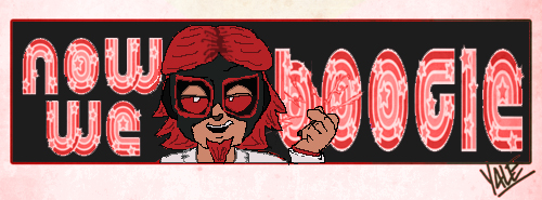
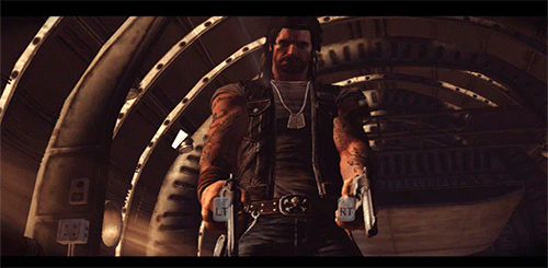
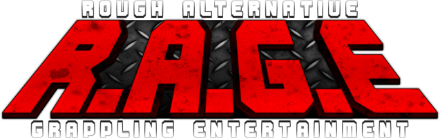
So for the past couple weeks, prior to debuting the show for TCW*'s new season, I have been brainstorming ideas on how to redesign the stage for our in-between shows show, Exclamation. Before I can get into revamping stages and arenas, I need to have a logo to start with. Some of you have already seen some of the drafts I have been working through on Twitter, and I'm hoping you folks would help me out with a final decision. Option A)  B)  C)  D)  E)  If you choose an option, but prefer a different color scheme or see anything you'd liked changed about it, please don't hesitate to bring it up! Thanks for your time! |
|
|
|
Post by gagegrayson on Aug 23, 2015 10:05:21 GMT -5
Might have voted for E if the "i" were an exclaimation mark like a couple of the other ones, all of these rule
|
|
|
|
Post by Normster on Aug 23, 2015 11:52:26 GMT -5
Voting B, but I think the gradient could be a lighter color that makes it more visible IMO
|
|
|
|
Post by Tiago on Aug 24, 2015 5:35:02 GMT -5
Option A is a no brainer!
|
|
|
|
Post by Brent Delivine on Aug 24, 2015 16:54:32 GMT -5
Personally i like A. The colors stand out alot more than ones with black gradient.
|
|
|
|
Post by Spooky on Aug 25, 2015 3:23:01 GMT -5
i vote for d. the gradient works well with the stroke
|
|
|
|
Post by Undamaged Threat on Aug 25, 2015 21:42:06 GMT -5
Option A
|
|